Five Small Ibexa DXP (eZ Platform) Features That Can Make or Break your Editorial Experience

Digital success doesn’t always lie in complex things, small features can often also make the difference. Here are five tips to engage and make your editorial users happy, coming at no extra cost – instead, through smart usage of eZ Platform.
Just a few months ago at Ibexa, we launched our new brand, which involved launching our new website ibexa.co. To that end, we decided to make a clear cut with our legacy website and not do a migration but build a full new site (only migrating programmatically some sections such as this blog, our customer stories and our partners’ profiles). And, as Jani already mentioned it on this blog, we naturally decided to eat our own dog food and to use the eZ Platform 3.0, and in fact we started on a beta version before v3.0 was generally released.
We worked fast, as a small team, basically five marketers, in charge of the different sections and regions, working on the site only part time (as an addition to our day jobs), two developers and one designer. It was great to be back at building a website with our product, and I forgot how much learning one gets from such journeys. Globally we are thrilled with the result, and the time it took us (just two very intense months), even if there are plenty of small things here and there that still need improvement. A website is never just a one-off project, you must manage it like a product, for the long run, with continuity.
While there’s much more to share, I wanted here to focus on some small things that can make or break the experience for your users in charge of creating content and building a new site.
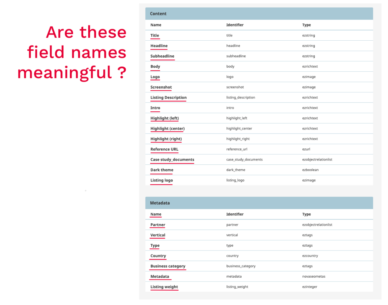
The Importance of Naming Your Fields Right
This is such an obvious one, and yet the vast majority of projects fail to get this right. In our case, I have to admit we could have been better. One of the core strengths of eZ Platform is its content engine, that can gracefully accept any content model, without having to ask much of a developer. We know that this is probably one area where eZ Platform excels and you’d be hard pushed to find an equivalent.
Administrators, who are generally either technical or functional ones, tend to be the ones that create the content model to best fit the information architecture you will end up dealing with on a daily basis. Part of this task covers creating content types and, of course, defining fields in your content types based on field types. When you observe users, you’ll be surprised by the damage a bad name, or a poorly positioned field definition can do! Interested for some advice? You can get some advice from Eileen Webb who has been writing and speaking about that on many occasions.
Field type edit interface screenshot
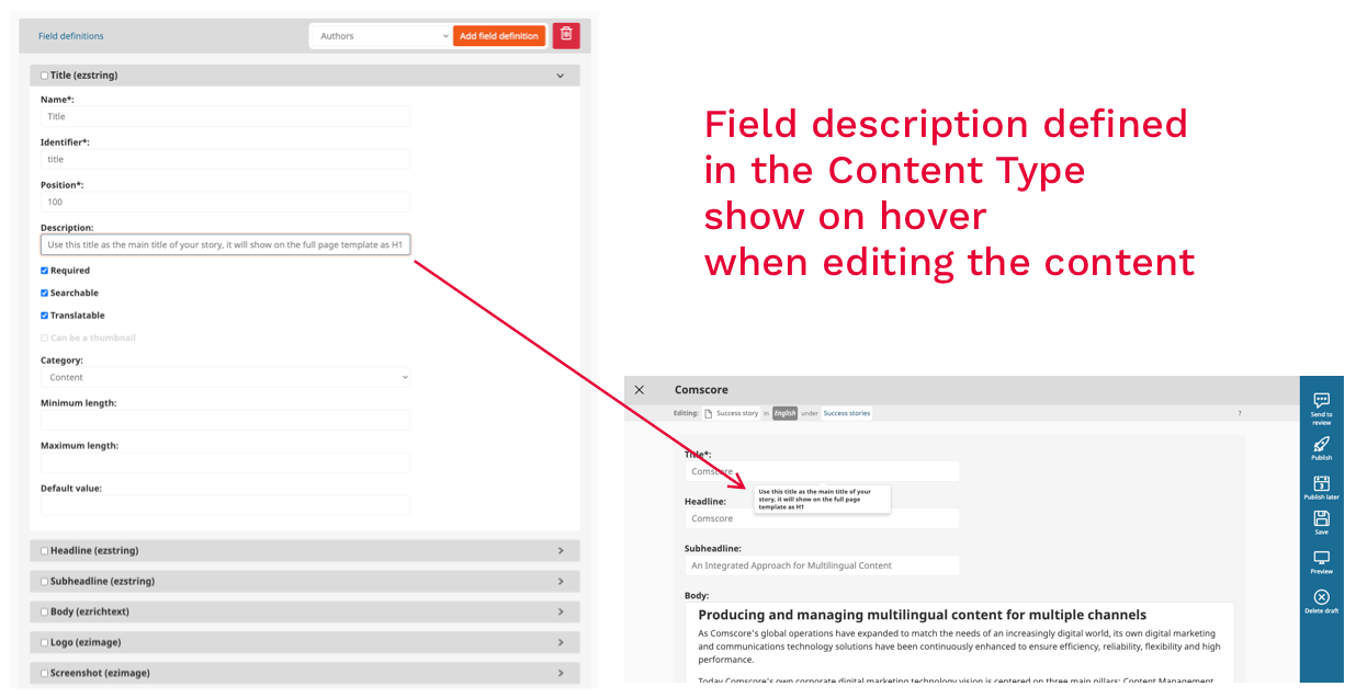
Adding descriptions to your fields
In direct relation to the previous point as well as the covered by Eileen Webb, and again vastly ignored by users, you should know that you can guide your users by telling them what each field is made for. This is typically done in the description of each field. I have to admit we are still looking at making the description more evident in the standard interface, but again, it’s as simple as a tooltip hover for the user to access a short description to help them in their work…but only if this description has been well defined by the information architect-in-chief. Please spend the time to think about it for your next projects, and train your users with that in mind.
Showing how descriptions look
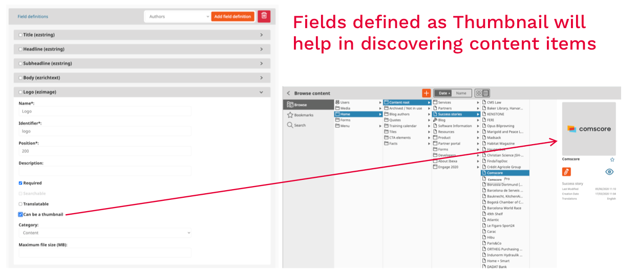
Choosing Which Field to Use as a Thumbnail When Navigating Content
Not too long ago, we added a way for administrators to decide which fields will be used for visualization of a content type in the Discovery Widget as well as in other places. It’s a simple yet powerful feature when dealing with complex content models. However, if you are not aware of its existence, your content types will always show as default in the Discovery Widget, regardless of their type. It doesn’t take much from the administrator – just a click enables the thumbnail at the field level – to change the discovery of assets, including visual content from frustrating to intuitive, and it makes the whole lot of difference!
Properly Defining Your Image Variations
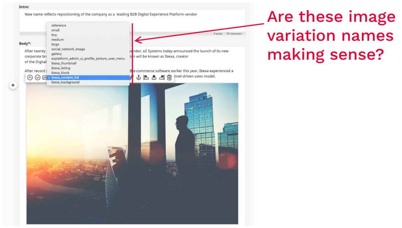
This is not a new tip, but can be the source of so much hesitation for editors. eZ Platform, just as eZ Publish, offers a powerful system of managing image "variations". Image variations let the system handle the rendering as well as the optimization of your images in the different size they are planned to be used by a site. This system, when used within the free-form online editor, enables editors to choose among a number of sizes when embedding images in their content.
When embedding an image in the editor, the user has the choice of different image sizes, as mentioned below. After choosing the variation, the image is then previewed in edit mode – which should give a fair preview of what will be the final rendering in the front-end. This sounds all good but when the list of variations is long, factoring this with the time for pre-rendering images, which can also be a bit slow, the experience can become annoying and can take time, becoming a real source of friction.
So the strong recommendation is to work ahead of time with your designers when building the information architecture, and then defining meaning full, clear and predictable labels for image variations.
It can be as simple as referring to the type of use and dimension:
- Landscape-2x3-w300: image will be adjusted to 300 pixel width, cropped at aspect ratio 2x3.
- Spread-2x1-h200: image will be adjusted to 200 pixel height, cropped automatically at 2x1 aspect ration.
- Free-w300: image will be adjusted to 300 width, uncropped (so heigth will depend of the original aspect ration.
- Banner-2x3-full: will use all the space in the element, and will crop to 2x3
Many other nomenclatures can be used. A basic rule however to ask the one setting your configuration: never stretch an image!
Using Field Categories Wisely
The way content type fields can be organized has been improved over the course of different versions. If at somepoint, the system was not providing very good usability, it's now got a very robust way to put some order in your content types by grouping and ordering fields in ways that make sense for the editors. For instance, when working on Product Information content types, it seems like a good idea to regroup the different fields in categories such as:
- General properties
- SEO metadata
- Marketing specs
- Tech specs
- Pricing and stock
Again, this is an example among many, but here as well, it's a simple administration task that can help introduce some order and make the system intuitive to editorial users.
We hope these tips from the trenches will help some of you to reach the best editorial experiences for your editorial teams. Please share in the comment below if you have any similar tips you think other web teams could benefit from.
eZ Platform is now Ibexa DXP
Ibexa DXP was announced in October 2020. It replaces the eZ Platform brand name, but behind the scenes it is an evolution of the technology. Read the Ibexa DXP v3.2 announcement blog post to learn all about our new product family: Ibexa Content, Ibexa Experience and Ibexa Commerce


