Why you might need UI guidelines
In the product development world there's a very famous gap every company has to bridge in its own way: how to connect design with engineering. Because of its impact on the development process, there are many suggestions and shared experiences on how to bring design and development closer together.
From the design perspective it's a very well known concern. Designers are trained on how important it is to communicate their process. Dan M. Brown's book is an example of communicating design through clean and detailed specs. Nonetheless, this isn't enough. We need to be more systematic in our approach.
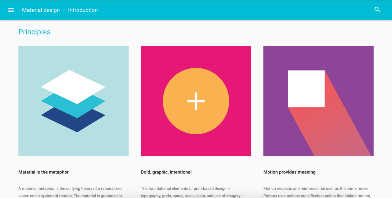
One key element that goes towards this effort is building a set of User Interface Guidelines (UI Guidelines). You may know this term, or maybe you have checked out some UI Guidelines online.The most famous ones are Google's Material Design.
Though primarily used for the responsive utilities, the popular frameworks Bootstrap and Foundations are in fact also sets of UI guidelines. The challenge when using Bootstrap and Foundations is that your interface and interactions can look the same as everyone else's. Furthermore, you need to take care of your company's brand identity, so it's more useful (and clean) to define your own library rather than overwrite the codebase.
What are UI guidelines?
UI Guidelines are the digital evolution of print-based graphic design guidelines, where the correct style and use of colors, icons and typography is defined. In order to create a cohesive experience in your application interface you need also to determine its different layouts, as well as each component included. Aside from components should be patterns, which are components repeated throughout your app. Finally, your product should be designed taking into account users of all abilities.
The most common metaphor used to describe a set of UI Guidelines are Lego's building blocks. Nathan Curtis even put the theme on his book's cover, Modular Web Design. He set the bar with his Modular Design paradigm making the book a really good recommendation for anyone interested in this particular field. For him, a "Component Library" is a collection of reusable building blocks for rapidly creating consistent screen designs.
There are more metaphors when talking about this topic. Curtis's cover also includes the recycling symbol. When advocating for a UI Guidelines we can adapt the Three R's of the Environment: Reduce, Reuse and Recycle. In our case we could adapt the Three R's to focus our efforts on the efficiency, constrained design and modularity. We have commented before the efficiency benefits. Regarding the other two, building a set of UI Guidelines will help us to have a constrained design, knowing when it's really necessary to design new elements. Last but not least, modularity, as one of the main objectives of UI Guidelines is the ability to create new components out of smaller ones.
Finally, there is also Brad Frost's paradigm: Atomic Design. He uses chemistry as an analogy. In his approach, you begin with the smallest unit-atoms-and define a new system that bonds together to form molecules, which when combined turn into more complex elements scaling up in complexity. He is one of the new voices that brings a fresh vision about UI Guidelines.
Why do you need UI Guidelines?
Susan Robertson's article on creating style guides frames the most important benefits of UI Guidelines: faster development time, improved communication among all the stakeholders involved in developing the interface (designers, developers, product managers, etc.), and keeping both code and design consistent throughout the site. I would underscore the importance of consistency among them because it strengthens the usability of your site's UI. Precisely, Norman Nielsen Group acknowledges the benefits of having guidelines for Agile environments, where the fast pace of development requires efficient design workflows.
Two approaches to developing UI Guidelines
Building a set of UI Guidelines is just the opposite of following a cooking recipe. In his book, Nathan Curtis emphasizes that if you have a consolidated, extremely detail-oriented workflow, and a fluid communication across departments in your company, then maybe there's no need to define anything. Add to this the fact that you need to adapt this experience to your company's regular roadmap. Bear in mind that this process requires investing time and resources. If you thought that this can be tackled quickly, like in a 100 meter dash, you are taking the wrong approach.
Because there are multiple ways of addressing this process, I am going to focus only on two approaches that are applied at different levels. In the first approach, we place all the components in one static library where everyone can check and replicate them in the codebase. In the other approach, we create a dynamic library that is part of the codebase, hence any change is automatically implemented to any interface.
Regarding the first approach, placing all the components in one library so everyone can check and make use of them relies on coordinated work among teams. Furthermore, extending the codebase becomes easier, since it will be based on a standardized process, as Susan Robertson points out. Besides the direct benefits, there are other indirect advantages.The onboarding process for new staff within your design or engineering teams will be more productive if you refer them to the new library.
The second approach clearly differs from the first I just described. Ian Feather gives some quite interesting reasons to opt for the second approach, and also criticizes the first one. For him the biggest threat a set of UI Guidelines can have is falling out of sync with your application. When that happens they lose their purpose. For this reason, he brings to the discussion the engineering perspective, with all the constant work that simple CSS updates can require. Feather proposes to create a very simple API to fetch all the templates from the Component Layer. Translated into plain English: apply design changes immediately throughout all your application interfaces. You can check Lonely Planet's Guidelines as an example pushing towards this direction.
Outcomes of creating UI Guidelines
Creating UI Guidelines is a serious time investment. You will notice that among most of the people that have shared their experience about this topic, like Future Learn's post on building a new pattern library, a new inventory is one of the most commented outcomes. In addition, when implementing a set of UI Guidelines for large and complex websites, like in a multi-device environment, they are even more powerful. Finally, another outcome is how they will affect the different teams involved in the product development process. UI Guidelines will probably modify some of the usual working paths among teams, in a good way. They will increase their efficiency and will communicate better.
In any case keep in mind that every company has its own culture, hence each process towards this outcome will be different. The decision of implementing UI Guidelines has to bear in mind the short-term benefits, but also the mid- and long-term ones. In addition, it's important to keep an Agile mindset when developing UI Guidelines. As Susan Robertson states: "It doesn't have to look perfect to be useful."
Resources To Get You Started
Maybe you are feeling a little bit overwhelmed right now. Keep in mind that someone else has been through this before. Anna Debenham shared not only her process, but also a list of front-end style guides and pattern libraries that you can use for kicking-off your process. There is more complementary stuff by Bryan Krall. If you just noticed that each guide or library is totally different from each other, don't panic. Tyler Sticka for instance, took some time researching Debenham's list and came up with a shared spreadsheet that includes instances of observed patterns, and also adds new ones. I'd suggest to not follow one guideline verbatim. You have to adapt your library to the real components your site has or may need. It's a communication process, so talk to your engineers and listen to their needs. Your language dictionary should offer meanings in both design and engineering contexts. The same applies to the components of your library-they have to be able to talk in design and engineering languages.


