Summer Release: eZ Platform v2.2
Summer has finally arrived, and besides the wonderful weather and sun to warm us up, we're also excited to announce the third fast-track release of eZ Platform: eZ Platform v2.2. Our amazing engineering team has been hard at work around the clock to introduce new features and capabilities to eZ Platform. Let's dive in and learn about these new features and how they improve the respective experiences for editors, website administrators and developers alike.
With the release of eZ Platform v2.2, we're continuing our efforts to make eZ Platform simple and easy to use for editors. When we created features such as the page builder, bookmarks and copy subtree, we specifically had marketers and editors on our minds.
What's in for editors?
Faster, better and friendlier Page Builder
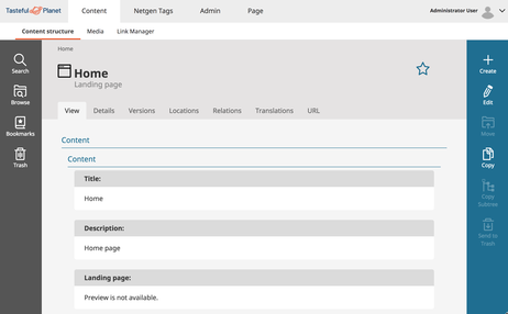
The first major feature of eZ Platform v2.2 is the new and revamped Page Builder, available solely for Enterprise Edition customers. The Page Builder is replacing the previous module Landing Page Manager.
The Page Builder has been completely rebuilt on the new architecture introduced with eZ Platform version 2. This new architecture is a big win for editors, because it's enabled the Page Builder to be way faster than the previous Landing Page Manager, making the page building experience faster and more enjoyable.
The Page Builder is also much more elegant and comfortable to use thanks to the new design relying on the UI guidelines introduced with version 2. It's also more powerful, allowing for advanced operations such as switching layout on an existing page and using different page content types with different fields. Editors can now easily switch from the page view to the field view, whether they are in View mode or Edit mode, to view or edit fields.
We look forward to hearing the user feedback on the new Page Builder feature.
Quick access to your favorite content with Bookmarks
Bookmarks is another feature that will simplify work for editors. Bookmarks allow editors to save different content items (articles, images, video, etc.) both from the main content view in the repository and from the Universal Discovery Widget (UDW). Editors can then access these bookmarks from multiple places, including the main dashboard, user menu and UDW.
Editors can now simply bookmark a specific content item, which might otherwise be tedious to find in the content tree, and quickly access it again without needing to browse the entire content repository. This will save time and make it more pleasant to work with large collections of content.
Bookmarks will also allow editors to streamline their work and assemble a list of future tasks to work on. Bookmarks are personal, so each user has the ability to manage, create or delete their own unique list of bookmarks. To learn more about bookmarks, check out the blog post "Bookmarks Feature Overview."
Localized versions of the administrative interface
Another big improvement with eZ Platform v2.2 is that the administrative user interface, is now localized into several different languages. And it's simple to add new localization, too, if need be.
Editors can now use the language they want to use eZ Platform with. All they would need to do is configure their browser, which in many cases will be automatic. The default language for the interface is English, but the interface for v2.2 has been shipped with several translations, including French, German, Norwegian, Polish, Spanish, and Russian. More languages can be added, hassle free, thanks to the contributions of our community.
More editorial experience improvements and good surprises
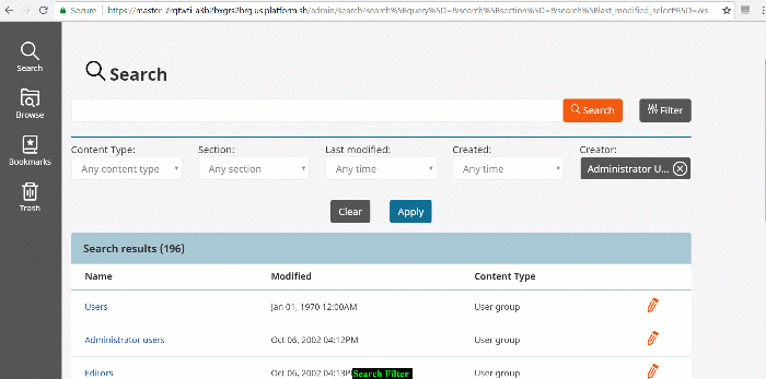
Some additional improvements with eZ Platform v2.2 may initially seem small, but actually provide a great amount of benefit to users. One example is the enhanced search filter capabilities that we first introduced in v2.1. For eZ Platform v2.2, we've decided to add a new filter so that users can search for content via content creators.
Here's a quick preview of the improved search filter capability:
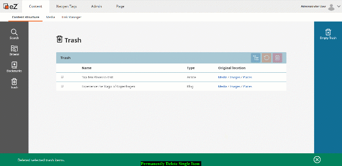
Another small, yet much needed improvement relates to the trash. Users are now able to permanently delete single content items without having to purge everything in the trash.
What's in for administrators?
Along with editors, website administrators will also be happy to hear that eZ Platform v2.2 has a number of features that will both save time and improve their day-to-day lives.
Simply knowing what users can and cannot do
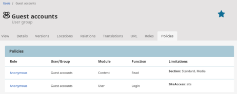
Understanding which permissions are assigned to users can be quite complex and time consuming. To simplify this process, we've included two new tabs in the user and user group views called Policies and Roles. These tabs allow administrators to easily view the policies and roles assigned to a given user or user group.
Using permissions in the Admin Panel more effectively
Previously, although permissions were applied to the system, the admin panel user interface was not adapted accordingly. This meant that users with limited permissions could try to access features they weren't permitted to use and get error messages in response. Now, if a certain user does not have the permission to access a certain function (i.e. access admin panel, create content type, etc.) then they will simply not see that particular feature. This simple change makes the permission system much more powerful and effective.
Saving more time by setting limitations for policy
When adding or creating a new policy, the administrator will now have the ability to define a limitation. Depending upon the policy, a limitation can be anything from content type, order, to location of the subtree. This new capability will reduce the time and resources required to maintain a certain policy.
Improved content type management interface
One interesting improvement relates to the content type management interface. The content type view functionality is now more user friendly and provides direct access to edit the content type. We've also added a sticky toolbar on the edit interface of the content types. This toolbar will make it simpler and faster to add field definitions to content types, eliminating repetitive scrolls up and down. The content edit has also been improved by letting the user fold or unfold the different field definitions.
What's in for developers?
Another priority for the release of eZ Platform v2.2 was to continue improving the developer experience. This has been taken into account with all features of the release, starting with the new Page Builder.
First of all, the new Page Builder lets developers create custom blocks for their pages in a much simpler way. For that, they only need PHP and Symfony skills-no need for advanced JavaScript knowledge anymore. All that's needed to create custom blocks is Twig templates, YAML configuration files and, optionally, some PHP code into controllers.
Another major update for developers is they can now use the page field type in any content type, giving them much more flexibility in how to build websites using different sets of fields for different pages, e.g. to manage metadata or specific business logic.
Customizing the design of your Page Builder blocks with ease and flexibility
All blocks have a redesigned configuration interface, but more importantly, there are two new fields to give some control over styling to the editor. They can now customize the CSS class to be used or even the CSS code. And this is all done in a safe way, as it only applies to the block. These two new class and style fields are for advanced editors only, so we allow administrators to decide in a configuration file if they should be enabled or not.
Customize admin UI with the design engine
Previously, we introduced a design engine in eZ Platform for the development of websites. Now we've decided to use the same design engine for the admin interface itself. The design engine provides developers with a simple way to override any template, graphic asset or CSS styles of the admin interface.
For example, developers can now easily customize the look and feel of the admin interface's top menu. This is just one of many examples, and developers can customize any part of the interface, whether it be a menu or just change an action bar.
URL pattern definition
Based on developer feedback, we introduced a way to define/customize the URL pattern used by the websites. This provides flexibility to customize the type of URLs for each site. By default, eZ Platform will now use lowercase URL with dash separators, as that was requested by most users and customers. While the direct impact on SEO is still to be demonstrated, this updated URL pattern definition will still save time and stay in line with the mainstream. For existing eZ users upgrading to v2.2, there will be the ability to configure the URL pattern to what was used prior to the upgrade, resulting in a transparent migration that doesn't imply any SEO struggles.
Using image placeholders for local dev environments
One of the last features we want to highlight will definitely improve the developer experience. Developers can now use image placeholders on their local installations. This feature is useful when working on large projects where it's challenging to have all the images and files present in production environment on the development environment. By saving time and resources (not having to synchronize every files), this feature is a great way for developers to preview their work without using the production image data.
A few more worthy mentions
There are few more features that are worth mentioning that can be extremely beneficial for developers. First of all, bookmarks are also accessible and manageable through the REST API. Also, moving forward we will be using Symfony 3.4.11 for v2.2, keeping us up-to date with Symfony's path.
When it comes to the localization feature introduced above, developers can contribute to an existing translation or create an entirely new translation, if need be. If you'd like to take part in this effort, consider signing up with Crowdin, a simple service that offers a very helpful in-context translation interface. Feel free to contribute to our efforts here: https://crowdin.com/project/ezplatform
Last but not least, we're very excited to finally share our new UI guidelines as a new part of our documentation. The UI guidelines reflects the components, features and patterns that underpin eZ Platform user interfaces and will help all developers better customize and extend eZ Platform user interface. In these guidelines, you will have access to recommendations for styles, color usage, icons and typography. To learn more about UI guidelines, read the blogpost "Why you might need UI guidelines" or the following documentation.
eZ Platform v2.2 is available on ezplatform.com and via composer update. eZ Platform Enterprise Edition v2.2 is available for customers in their support portal. eZ platform Enterprise Edition v2.2 is available as a trial for partners in the partner portal. It is of course also available on eZ Platform Cloud. To see the full list of our new features, check out our release notes as well as the link to the list of changes on Github for open source and enterprise edition.
If you have any questions, please feel free to drop us a comment on https://discuss.ibexa.co/ or write us at productmanagement@ibexa.co
eZ Platform is now Ibexa DXP
Ibexa DXP was announced in October 2020. It replaces the eZ Platform brand name, but behind the scenes it is an evolution of the technology. Read the Ibexa DXP v3.2 announcement blog post to learn all about our new product family: Ibexa Content, Ibexa Experience and Ibexa Commerce

