Building the Ibexa website: Managing Menus

In the first part of the series of articles describing how we've built the Ibexa website we discussed the high level architectural choices made. In the second part, we discuss the menu system we're using. Menus are quite mundane, but behind the scenes fluent and flexible managing of menus is crucial part of day-to-day operations.
There is no single way of creating menus when working with Ibexa DXP. Developers can choose to use the content structure to generate matching menu structures. This can work well for many implementations (or parts of them) like eCommerce sites where the tree structure is a natural match for creating of product categories.
With more content-driven sites and web applications such an approach will not often work as well. You would lose some flexibility, and might need to create extraneous objects in the structure just to serve the menu. This is not ideal as it can get confusing over time. This is why we chose to decouple the menus from the content hierarchy.
In our implementation the menus live in a separate branch of the content tree. Both can be modified independently. We placed the menu branch in its own section in the backend. Below you can see the menu structure in the administration interface:
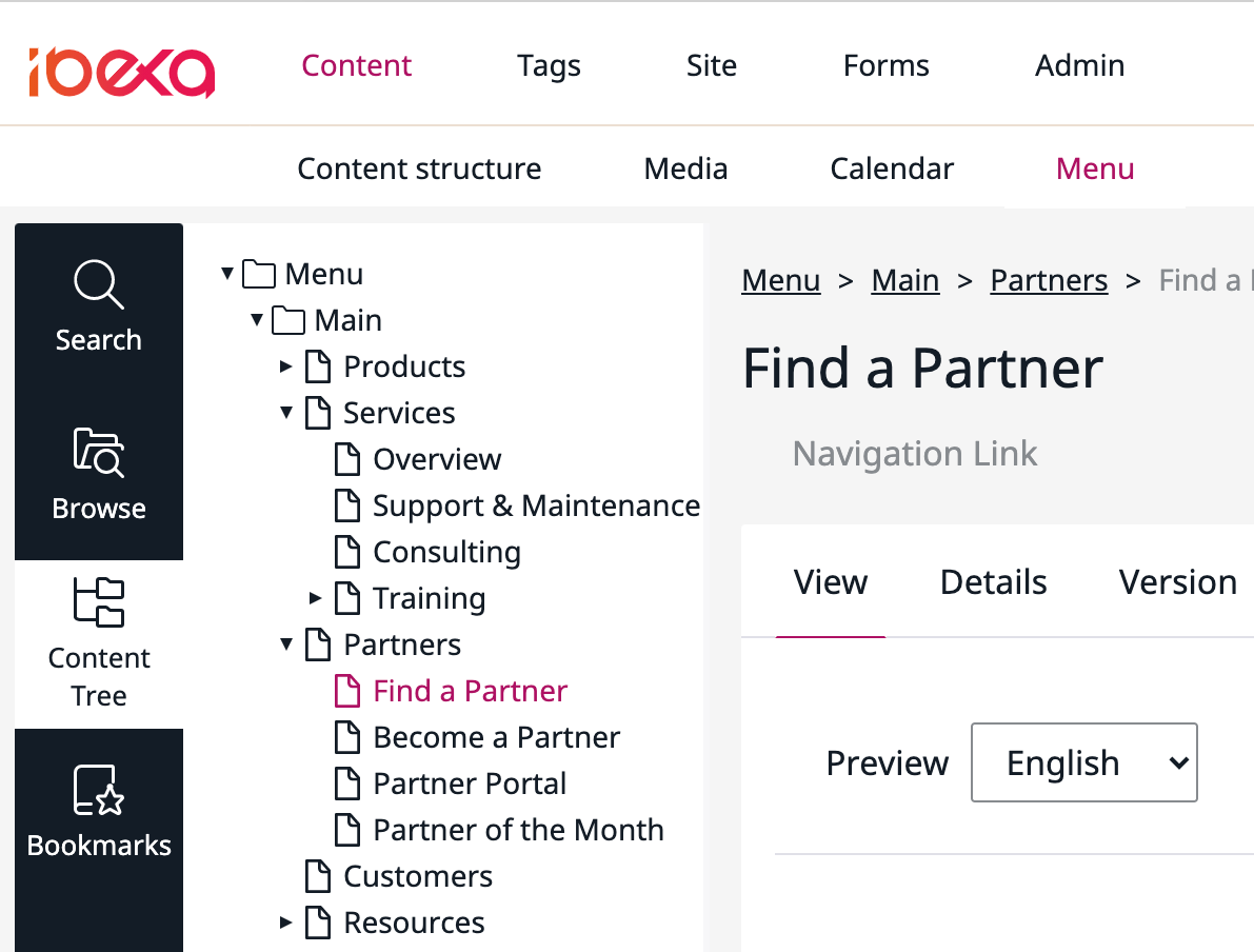
The structure is rendered into a menu on the front end with the KnpMenuBundle also used by the Ibexa DXP back office. The current public menu design looks like this:

To allow maximum flexibility of the menu items, we built a custom content type (Navigation Link) that has a number of fields enabling the editorial team to create links to internal and external resources as well as manage miscellaneous properties like the description and whether the link should open in a new window:
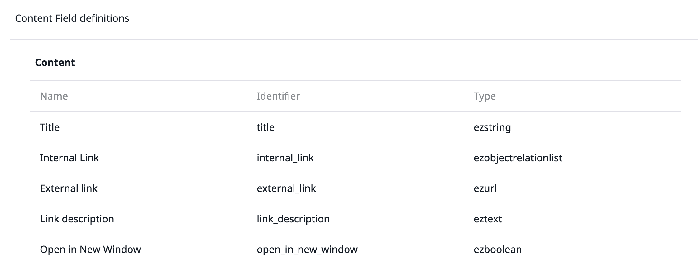
In addition to the main menu we also have similar a separate sub-branch for the footer that also reuses the front end code, but with a separate design:
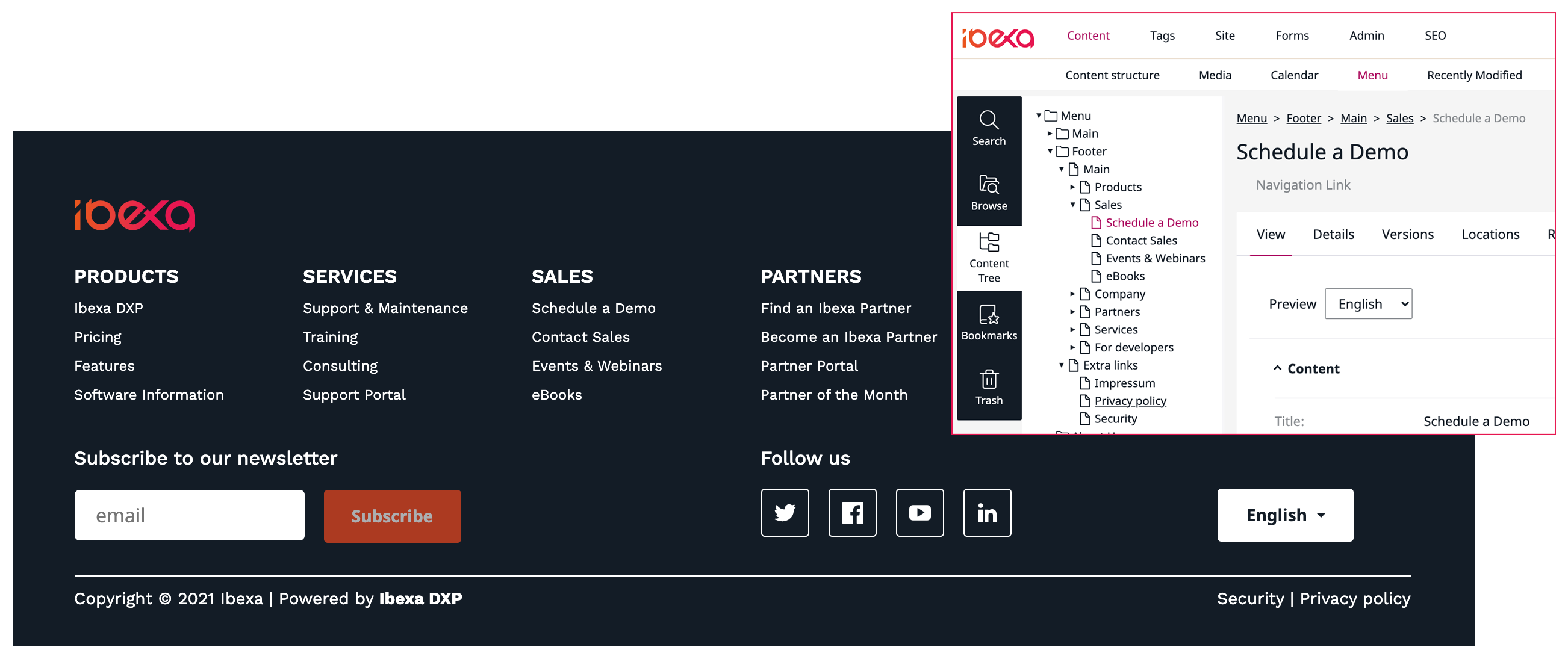
This pattern of creating and managing menus with Ibexa DXP is tried and tested method that gives freedom of custom menu and even complex logic in cases where you need to combine static menus and dynamic listings if needed. It also gives the editorial team control over the menu structure without its management being a developer task.
Multilanguage and multisite navigation
Menus are often considered simple (and in the best case, they are), but there are some hidden complexities when starting to work with multilingual and multisite navigations. In the multilingual case, you might have the issue that there is no content parity between the language versions. One size might not fit all.
Let's consider an online service operating in the whole Canadian market. Maybe English is the main locale, French is a close second, but Cree, Inuktitut and Ojibwe are served with a simpler structure. This is manageable by having two menu branches, one for English and French and another for Cree, Inuktitut and Ojibwe.
The administrators can manage both branches by creating the wanted translations. The front ends can then be configured to pick up the correct branch and translations for menu generations. This means no code would need to be duplicated or forked, it will just function differently based on the configuration. This reduces complexity.
In Ibexa DXP, a multilingual installation is most commonly implemented using siteaccesses. This means that a configuration for a site (or language version) is matched to a URL. The configuration contains a number of variables, including the used language locale. Once the siteaccess is selected correctly, the system picks up the correct translation and uses it for the menu. For selecting the correct branch we can define custom configurations, in this case the numeric identifier of the menu branch.
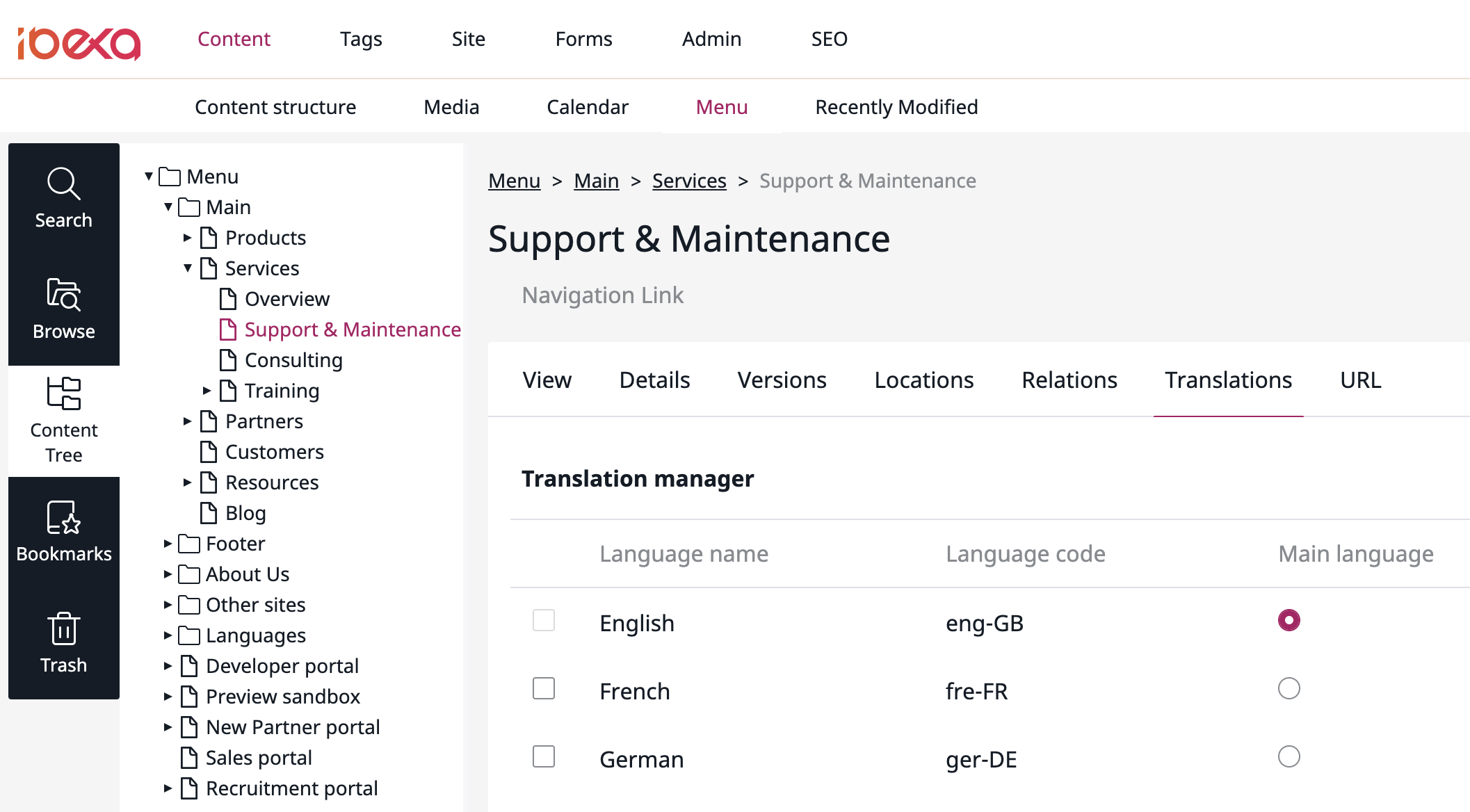
For the main Ibexa website we use the multilanguage feature to create one main site with multiple translations. The site administrators can translate the menu structure to their respective languages from under a single main navigation branch, for example, the Support & Maintenance Services section menu item as shown below:
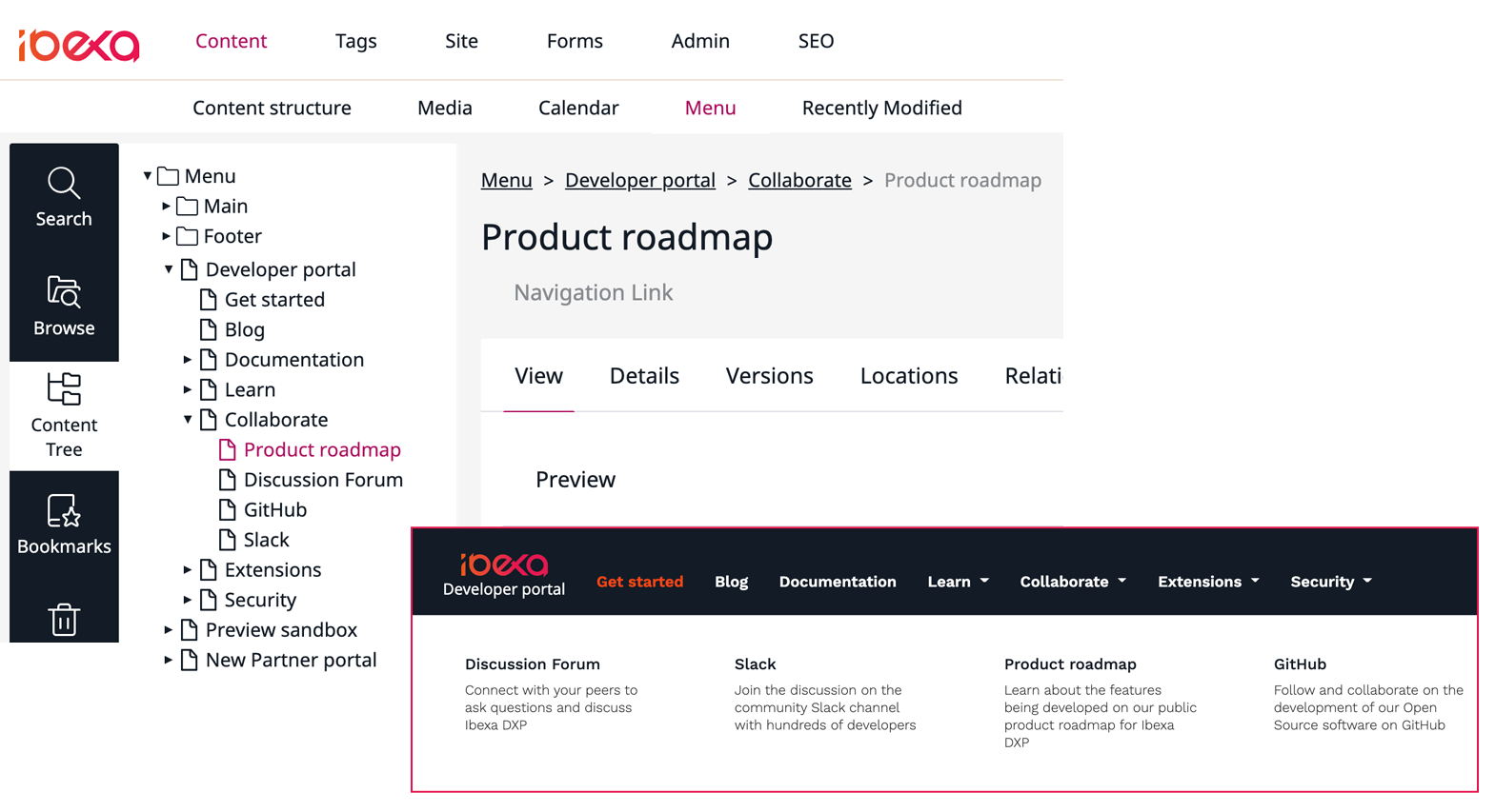
In addition to the main site we have a collection of supporting sites like the Developer Portal and the Partner Portal. For these languages we currently only offer an English version, but they have a completely different menu structure for the main navigation in the header. The footer menu is shared with the primary site.
For the secondary sites we have created individual navigation branches with their own unique structures and configuration as shown in the image below:
This concludes the quick look at how the menu system works on this website. So far this approach has served us well, allowing the administrators to manage the menus on a number of multiple sites. Once the initial development was done there has been no need for changes, aside from a visual design refresh we deployed without issue.
Photo by Levi Elizaga on Unsplash
